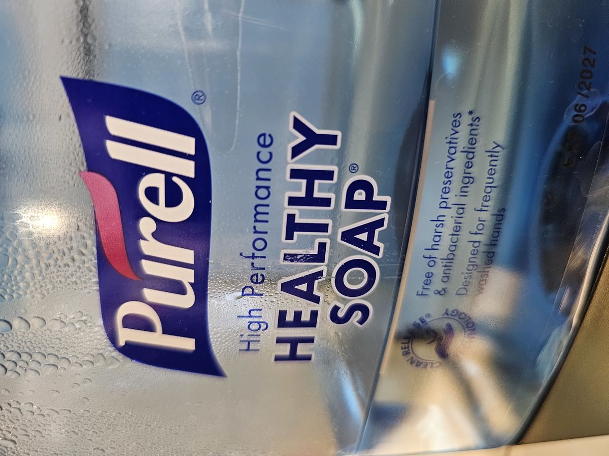
Came across this handwash last week.
If you read the label, it is free of harsh chemicals and designed for frequently washed hands.
But before I read anything, the soap color and industrial packaging tells me, without words, this liquid bleach will destroy my hands (and so use sparingly).
Just a nice simple example where the mind ignores the words - the rational stuff – and jumps to associations which are non-verbal.
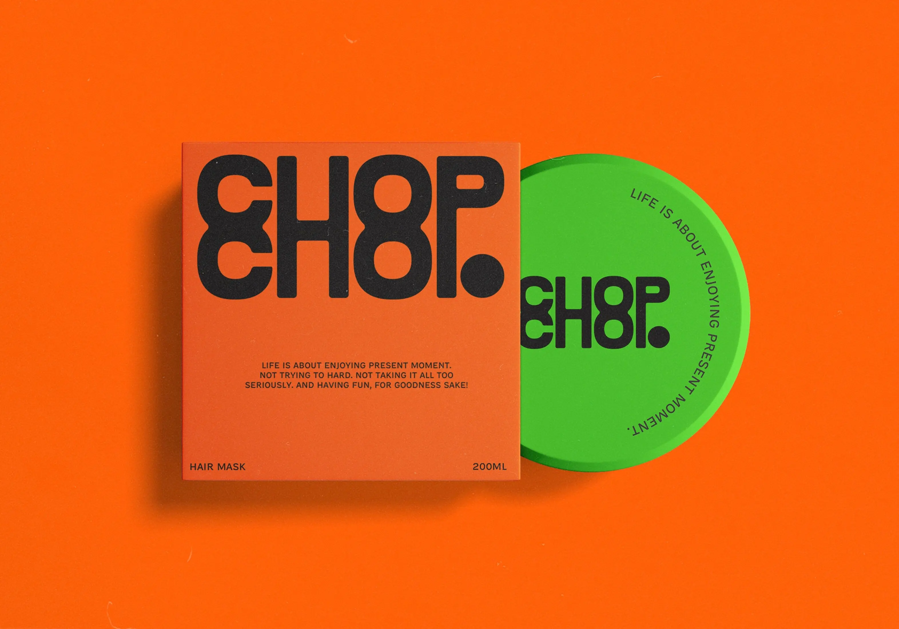
We are used to seeing fancy or 'organic' brands use a very different design (eg below from Self Studio).

Why is this relevant?
If you work in tech or IT or any 'professional' field, you are probably used to things being taken more literally or 'rationally'. The above is just an important reminder to factor in the non-verbal, as you go about life.
Rory Sutherland talks about this with wedding invitations. An email would achieve the same thing – but it also sends a signal that you're cheap. Sending something on expensive card is much better, even though its not 'rational'. Indeed it's inefficient and worse for the environment.
Yet one signals 'I am cheap', and the other signals something more impressive.
Can't lose sight of that.
